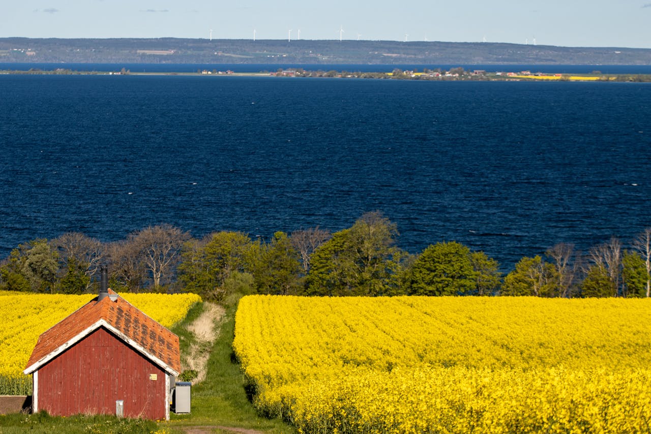
Color Correction

Making Colors More Vibrant

Vibrant photos

Colors are rich and full, look energetic

Dull photos

Colors are pale, look lifeless

  • Saturation is the tool that controls color vibrancy
  • Imagine: Like adding color to black and white photos
  • Find "Vibrance" slider, drag right (+10 to +30)
  • Why use "Vibrance": It protects skin tones from looking strange
  • Regular "Saturation" works too, but be careful with portraits
  • After adjustment: flowers redder, sky bluer, grass greener
  • Landscape photos: Usually can increase vibrancy
  • Flower photos: Moderate increase makes flowers more beautiful
  • Portrait photos: Be careful, don't make skin tones look strange
  • Cloudy day photos: Usually need a bit more vibrancy
  • Adjust little by little, increase gradually
  • If colors look fake, you've overdone it
  • Pay special attention to skin tones in portraits
  • Remember: Natural beauty is more important than vibrancy

Adding Mood with Colors

pexels-sebastian-165505
Warm photos

Yellow-orange tones, feel cozy
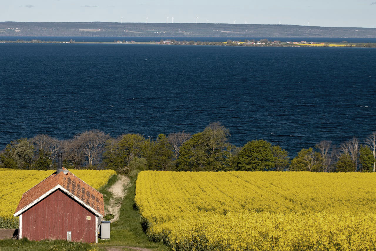
mick-haupt-t61i8PyF8K0-unsplash
Cool photos

Blue-cyan tones, feel distant
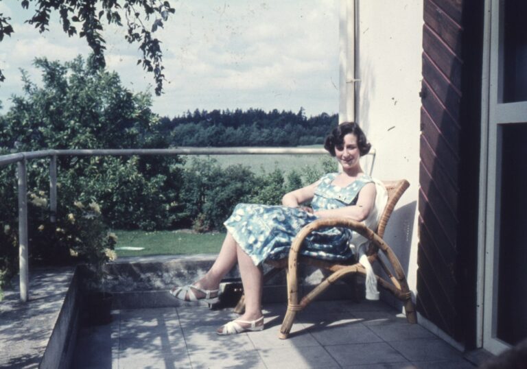
annie-spratt-Wnvop1QVADQ-unsplash
Vintage photos

Less vibrant colors, nostalgic feel
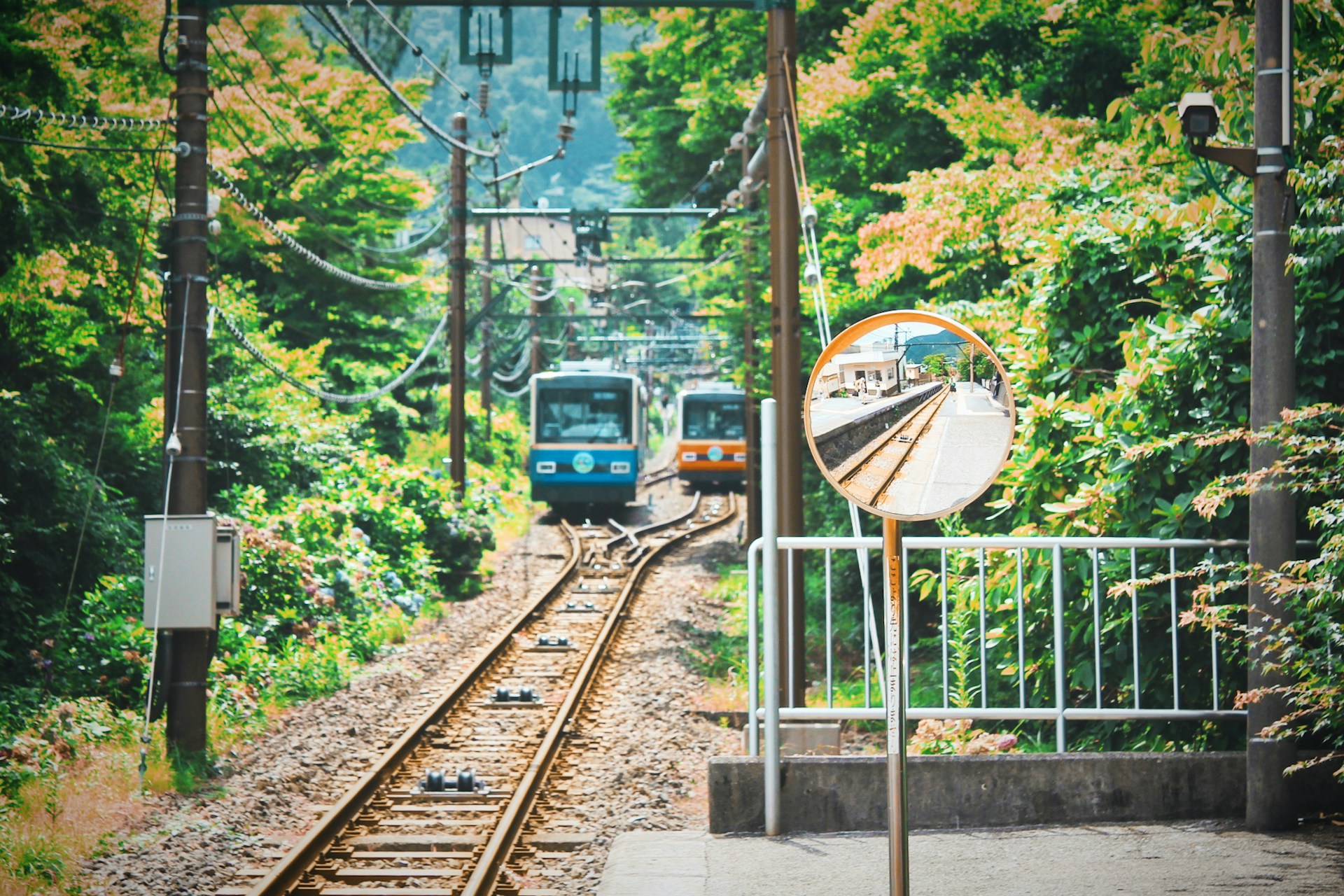
  • Like dressing photos in different colored “clothes”
  • For warmth: Add orange to highlights in "Split Toning"
  • For coolness: Add blue to shadows in "Split Toning"
  • For vintage: Lower saturation, slightly warmer overall
  • Remember: Subtle adjustments have big effects
  • Japanese fresh: Overall bright, lighter colors
  • Cinematic: Orange skin tones with blue backgrounds
  • Vintage film: Lower vibrancy, add warm tones
  • Modern fashion: Strong contrast, cooler colors
  • Family photos: Use warm tones for intimacy
  • Landscape photos: Choose tones based on season
  • Portrait photos: Warm tones usually more appealing
  • When unsure: Keep it natural

Making Multiple Photos Match

  • Social media: Multiple photos look more coordinated
  • Making albums: Unified style looks better
  • Same event photos: Consistent colors look more professional
  • Like coordinating outfits
  • Choose the best-looking photo as standard
  • Adjust other photos to match this one
  • Main adjustments: brightness, color temperature, vibrancy
  • Make all photos look like a series
  • First adjust one photo well
  • Copy this photo's settings
  • Paste to other similar photos
  • Fine-tune each photo individually
  • Travel photos: Unify style across all photos
  • Event documentation: Maintain consistent overall tone
  • Product photography: Ensure accurate colors
  • Portrait series: Unify skin tones and background colors

Creative Color Grading

Japanese fresh

Overall bright, light colors

Vintage film

Warm colors, moderate contrast

Cinematic grading

Orange-blue contrast, rich layers
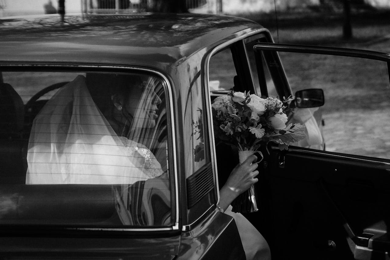
Classic B&W

Remove color, emphasize light and shadow

  • Based on content: Warm for portraits, seasonal for landscapes
  • Based on purpose: Trendy for social media, cozy for family
  • Based on preference: Find your own style
  • Reference trends: But don't blindly follow
  • Monochrome challenge: Use only one color family
  • Complementary colors: Use contrasting colors for visual impact
  • Gradient effects: Transition from one color to another
  • Zone coloring: Different tones for different photo areas
  • Create your own presets
  • Record adjustment parameters
  • Build personal color library
  • Share your discoveries with friends