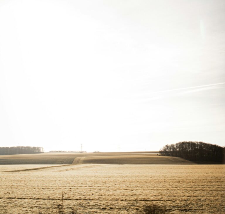
Overexposed photos
White areas lose detail, appearing bleached

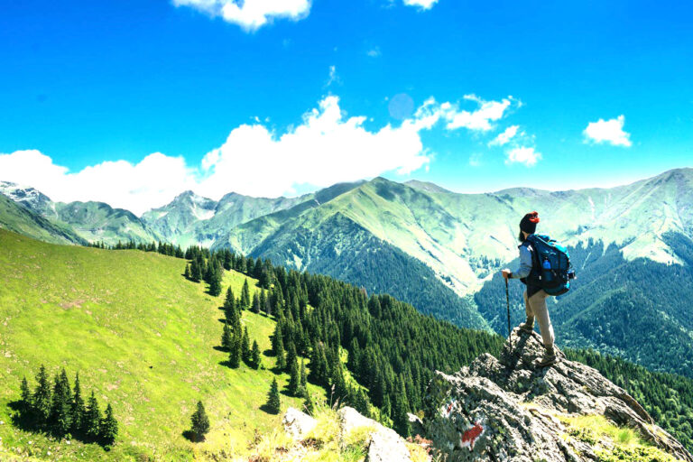
Perfect photos
All details visible with balanced brightness
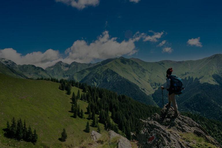
Underexposed photos
Dark areas are unclear, like in shadows

Vivid photos
Clear contrast between black and white, looks three-dimensional

Flat photos
Grayish and dull, looks two-dimensional
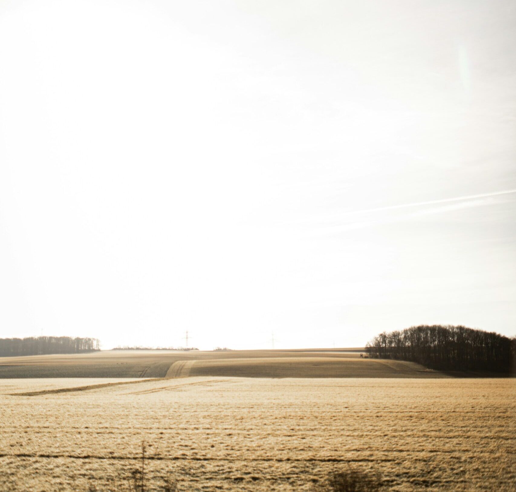
Sky too white
Can't see cloud shapes

Shadows too dark
Can't see faces or important parts clearly
Photos too yellow
Like old photos with yellow tint

Photos too blue
Like shot in shadows, cold feeling
Normal colors
White objects look white